Optum Store
Making healthcare feel less like a system, and more like something you can actually use
Overview
Healthcare isn’t supposed to feel confusing, but most of the time, it does.
Too many steps. Too many unknowns. Too many moments where people stop and think, “Wait… what am I supposed to do here?”
That’s what we were up against when we set out to build Optum Store.
The idea was simple, but the execution wasn’t.
What if getting care felt as easy as ordering something online?
One place where you could:
get a prescription without a doctor’s visit
transfer meds without calling a pharmacy
book care without waiting on hold
and shop products that actually work with your benefits
All without needing to “figure it out” along the way.
That’s where I came in.
As the sole UX writer on the experience, I owned every word across the product. Not just writing, but shaping how the entire experience felt. My job was to remove hesitation, reduce friction, and make people feel like they knew exactly what to do, even if they’d never done it before.
Because in healthcare, clarity isn’t a nice-to-have. It’s the difference between someone moving forward… or dropping off completely.
And it worked.
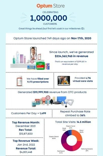
In under two years, we built a $200M+ business and supported over 1 million customers, by making something complicated feel simple.
Prescription Transfer Flow for Virtual Pharmacy
Because moving your medication shouldn’t feel like paperwork
The problem
Transferring a prescription is one of those things that sounds simple… until you actually try to do it.
Call the pharmacy. Wait on hold. Dig up information you don’t have. Get stuck halfway through and give up.
We needed to remove all of that.
The approach
We designed this flow to feel familiar. More like ordering a pizza than navigating healthcare.
Step by step. No guesswork. No dead ends.
What I focused on
I wrote every moment with one goal in mind: keep people moving forward
Microcopy that guides, not overwhelms
Clear, simple instructions so users always knew what to do nextError messages that don’t punish users
Instead of “something went wrong,” we told them exactly what happened and how to fix itCTAs that create momentum
“Transfer My Prescription” wasn’t just a button, it was a nudge to keep goingSupport before confusion happens
Small moments like “Where do I find my prescription number?” prevented drop-off before it startedFAQs that actually reduce friction
Answered real questions at the exact moment users were thinking them
The impact
We didn’t just simplify a process.
We turned something people avoid into something they could actually complete.
FSA/HSA Eligibility Tool
Answering the question everyone has, before they have to ask it
The problem
Every FSA user has had this moment:
“Can I actually use my money for this… or am I about to find out the hard way?”
That hesitation kills conversion.
The approach
Instead of waiting until checkout to tell users “no,” we made eligibility clear upfront.
No surprises. No second guessing.
What I focused on
This was about confidence and trust
Plain language over financial jargon
“This item qualifies” vs. forcing users to interpret policy languageClarity in edge cases
When something wasn’t eligible, we explained why, and what they could do insteadCTAs that keep users exploring
“See eligible products” turned a dead end into a new pathEducation baked into the experience
Not everyone knows what FSA/HSA means, so we made it easy to understand without leaving the flowFAQs that reduce support tickets
Answered the questions users were already asking in their heads
The impact
We removed doubt from the purchase decision.
And when you remove doubt, people move forward.
Virtual Care Appointment Booking Flow
No calls. No waiting. Just get the care you need
The problem
Booking a doctor’s appointment still feels stuck in the past.
Phone calls. Hold music. Limited availability. Friction at every step.
The approach
We made booking feel like something you could do in seconds, not something you had to plan your day around.
What I focused on
This flow was all about reducing anxiety and building confidence
Step-by-step guidance that feels effortless
No medical jargon, no confusion, just clear directionError states that keep users in the flow
If appointments weren’t available, we didn’t stop them, we gave them optionsCTAs that feel decisive
“Schedule My Appointment” gives a sense of control, not hesitationExpectation-setting moments
“Here’s what you’ll need” removes uncertainty before it becomes a blockerFAQs that build trust
Helped users understand what virtual care actually looks like
The impact
We made getting care feel accessible.
Not like a system you have to navigate, but something that works for you.