
Optum Now Navigation
Built from zero, so people wouldn’t have to think twice
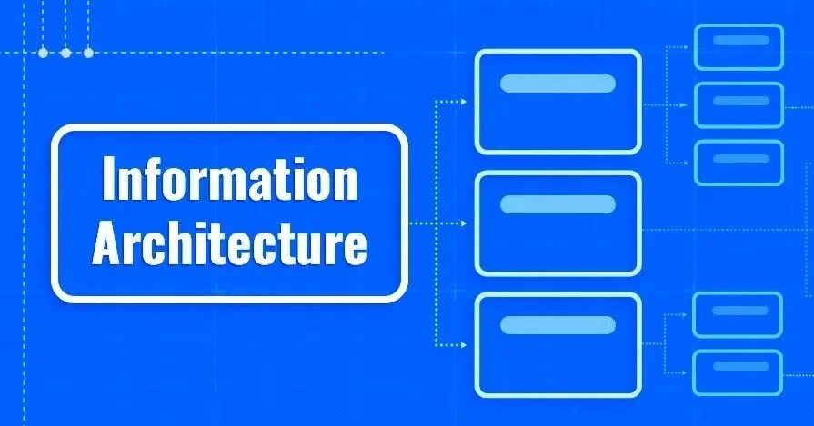
The starting point
This wasn’t a redesign.
There was no messy system to clean up. No labels to tweak.
We were launching something entirely new, which meant one thing:
We had to decide, from scratch, how people would find their way through it.
Care. Prescriptions. Products. Articles. Providers.
All of it had to live in one place and make sense immediately.
Because if someone lands on your site and has to stop and figure out where to go, you’ve already lost them.
-
Healthcare doesn’t come neatly organized.
People don’t think in categories. They think in moments:
I need a doctor.
I need to refill something.
I’m trying to figure out what this symptom means.But most systems aren’t built that way.
They’re built around internal teams, business lines, and technical constraints.
So the real challenge wasn’t just organizing content.
It was translating a complex system into something that matched how people actually think. -
I led the navigation and category design from the ground up.
That meant defining:
the top-level structure
how everything should be grouped
and how to label it in a way that felt obvious, not learned
Not just naming things, but shaping how the entire experience is understood


-
Unclear Navigation Hierarchy:
The original navigation structure lacked clarity, making it difficult for users to understand how categories and subcategories were related.
Misaligned Language:
Terminology in navigation and category labels didn’t align with user expectations or how they naturally searched for content.
Overlapping and Confusing Categories:
Some categories were too broad or redundant, leading to inefficiencies and user frustration.
Low Discoverability:
Important content, products, and services were not easily accessible due to unclear or buried navigation paths.
-
Initial Navigation and Category Design:
Developed the first iteration of navigation labels, category names, and groupings, focusing on simplicity and clarity.
Ensured all initial content reflected logical groupings and user-centered language.
Research-Driven Refinement:
Refined and iterated on the navigation structure and labels through insights gathered from:
Card Sorting: Captured how users intuitively grouped content.
Tree Testing: Validated the effectiveness of the hierarchy and label clarity by testing navigation flow.
Usability Testing: Addressed pain points uncovered during testing to ensure users could easily navigate and find what they needed.
Adjusted the structure and language to better align with user expectations while maintaining business priorities.
Content Design and UX Writing:
Refined labels to be concise, consistent, and reflective of user needs and mental models.
Balanced clarity for users with business objectives, ensuring key services and content were prioritized.
Information Architecture Strategy:
Collaborated with UX researchers and designers to refine the hierarchy and ensure logical grouping of categories.
Ensured the navigation was scalable and could accommodate future additions without creating confusion.
Competitor Analysis:
Benchmarked against competitor navigation strategies to identify best practices and areas for differentiation, ensuring Optum Now’s navigation stood out while meeting industry standards.
-
The improvements showed up clearly in testing, not just in how the navigation looked, but in how people actually used it.
Task success improved from ~50% to 85%+ in tree testing
Users were far more likely to find the right category or destination on the first tryTime to find key content decreased by ~30–35%
Less searching, fewer clicks, more direct pathsMisclicks and backtracking dropped by ~25–30% in usability testing
Users made fewer wrong turns and recovered less oftenStronger alignment with user expectations
Card sorting results showed significantly higher agreement between how users grouped content and how the navigation was structuredImproved discoverability of key services and content
Care, prescriptions, and products became easier to find and exploreHigher task completion across core journeys
More users successfully completed actions like finding providers, booking care, and navigating to relevant content
The biggest shift was subtle but important.
Users stopped pausing.
They weren’t asking themselves where something might be.
They just moved through the experience and got to what they needed.And for a brand new site, that’s the difference between something that looks organized and something that actually works.