
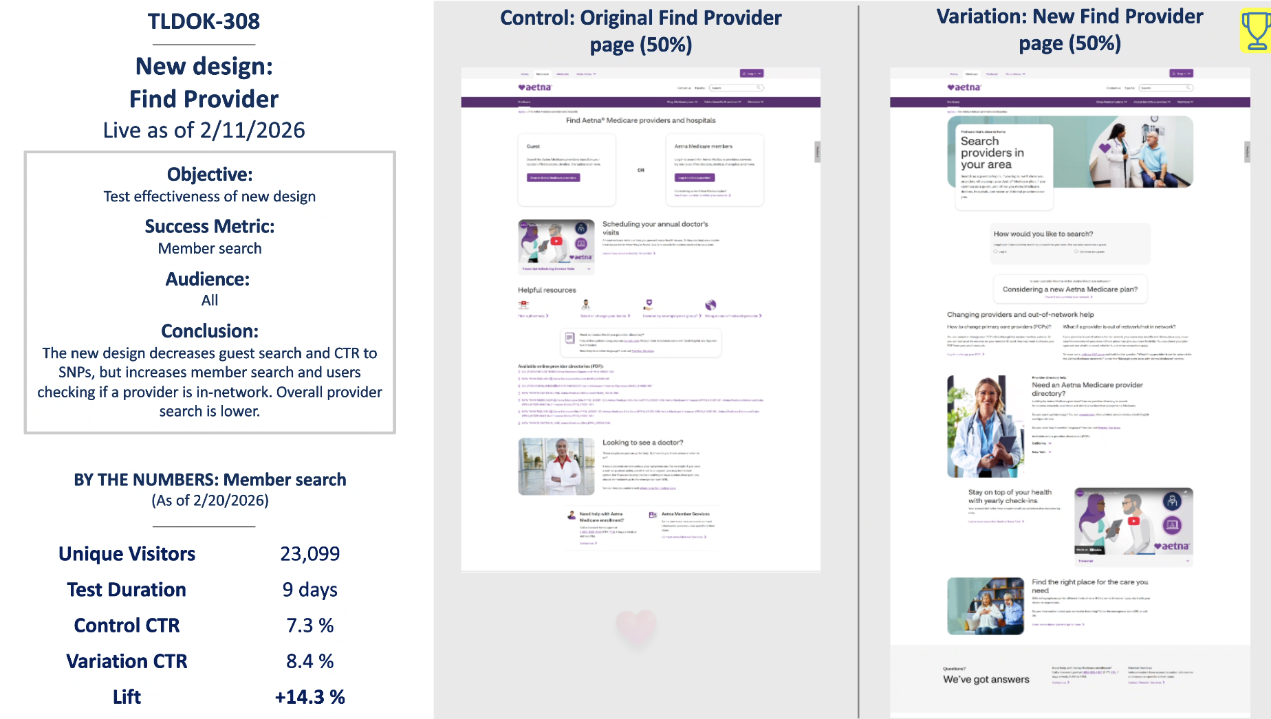
Find Provider — page redesign
Aetna Medicare · Live 2/11/2026 · Content Designer, UX Writer & Content Strategist
The Find Provider page is one of the most important task-based experiences for Aetna Medicare users. People come to this page with a clear need: find a doctor, search for care, or confirm whether a provider is in network. The challenge was making that path easier to understand for both guests and existing members, while also helping users choose the right search experience.
I led the content strategy and UX writing for the redesigned page, working closely with design and product to support a cleaner, more guided experience. The test launched on 2/11/2026 and compared the original Find Provider page against a redesigned version.
-
I helped reshape the page from a more transactional search entry point into a clearer decision-making experience. The content was designed to help users understand what they could do on the page, which search path was right for them, and why logging in could give members a more personalized result.
Key content updates included:
Reframed the page around the user’s task, making provider search feel easier and more approachable
Clarified the difference between searching as a guest and searching as a member
Added stronger guidance around finding providers in the user’s area
Supported content around provider directories, in-network care, PCP changes, and out-of-network help
Organized supporting resources so they felt useful without distracting from the main search task
Used plain language to explain Medicare provider search concepts in a more digestible way
-
The original page gave users access to provider search tools, but the experience placed a lot of responsibility on the user to understand where to go next. For Medicare users, that can create friction, especially when the difference between guest search and member search is not immediately clear.
The redesign addressed several content and UX issues:
Users needed clearer guidance on how to search
Members needed a stronger reason to log in before searching
The page needed to better explain the value of checking whether a provider is in network
Supporting content needed to be easier to scan and understand
The experience needed to reduce confusion without overwhelming users with too much detail at once
-
The redesigned page increased member search behavior, which was the primary success metric for the test. Over a 9-day test with 23,099 unique visitors, member search CTR increased from 7.3% to 8.4%, creating a 14.3% lift.
The results showed that clearer content, stronger task guidance, and better framing around member search helped more users take the preferred action. While the redesign decreased guest search and CTR to SNPs, it increased member search and users checking whether a provider was in network. Overall provider search was lower, but the test showed meaningful improvement in the higher-value member behavior the team wanted to encourage.
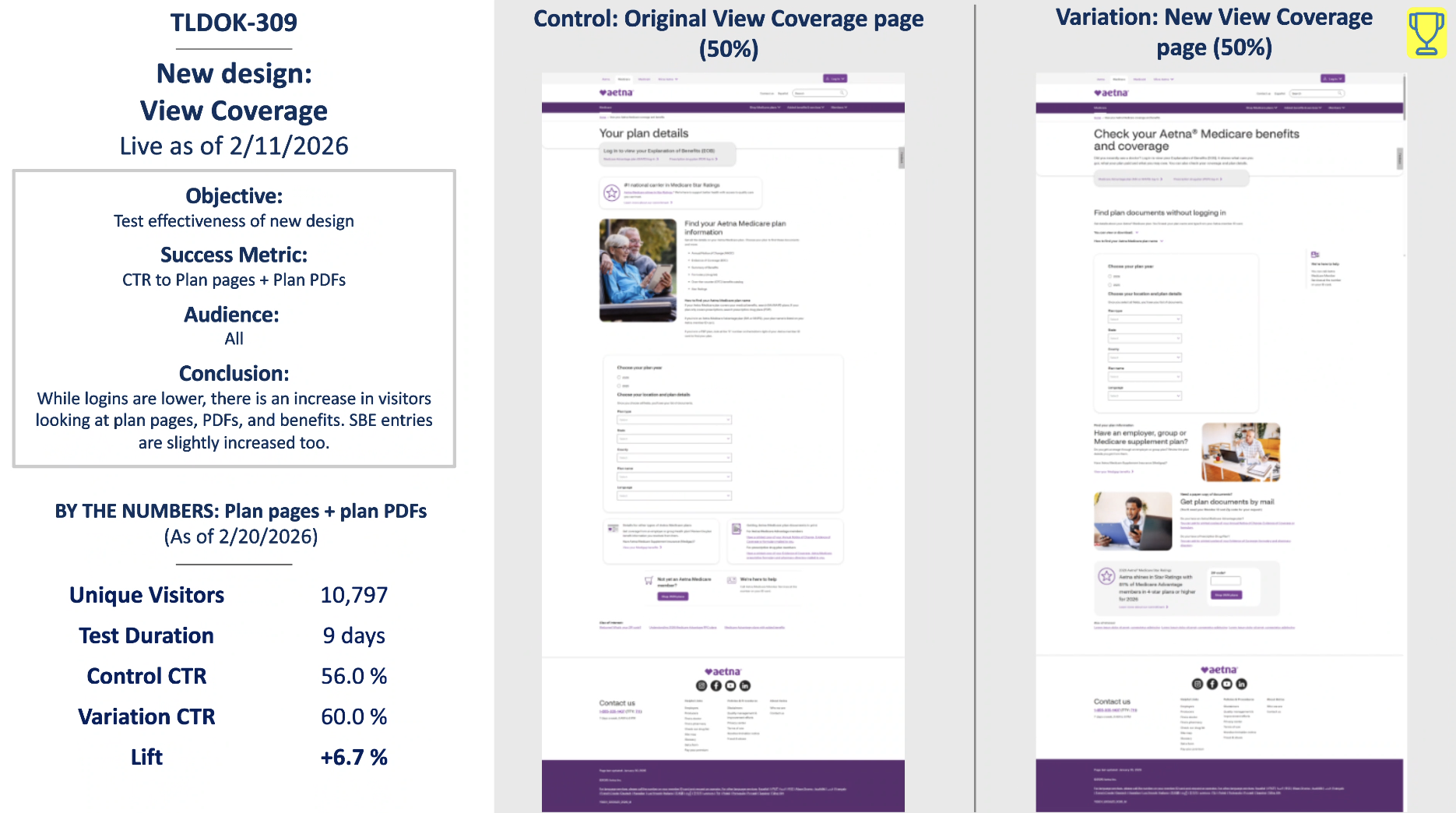
View Coverage — page redesign
Aetna Medicare · Live 2/11/2026 · Content Designer, UX Writer & Content Strategist
The View Coverage page helps Aetna Medicare users find plan information, coverage details, plan documents, benefits, and related resources. Because this page supports both research and self-service tasks, the content needed to work hard without feeling dense or confusing.
I led content for the redesigned page, partnering with design and product to create a more structured experience that helped users find coverage information faster. The test launched on 2/11/2026 and measured CTR to plan pages and plan PDFs.
-
The redesign focused on making the page easier to scan, easier to act on, and more supportive of different user needs. Some users arrive looking for plan documents without logging in. Others need help understanding benefits, coverage, employer or group plans, or how to get documents by mail.
Key content updates included:
Reframed the page around checking Aetna Medicare benefits and coverage
Improved the hierarchy of plan document search content
Clarified what users could do without logging in
Created clearer pathways to plan pages, plan PDFs, benefits, and related resources
Added more helpful section framing for employer, group, or Medicare supplement plan users
Supported plain language explanations for coverage-related tasks
Helped reduce friction by making key tools and documents easier to identify
-
The original page had the right information, but the content hierarchy did not make the most important actions immediately clear. Users had to work harder to understand where to find plan documents, what information they needed to enter, and which pathway applied to them.
The redesign addressed several key issues:
Important coverage tasks needed clearer placement and labeling
Plan document search needed stronger instructional copy
Users needed to understand what they could access without logging in
Related coverage resources needed to feel connected, not scattered
The page needed to support multiple user types without becoming overwhelming
The experience needed to increase clicks to plan pages and PDFs
-
The redesigned page helped more users take action on coverage-related tasks. Over a 9-day test with 10,797 unique visitors, CTR to plan pages and plan PDFs increased from 56.0% to 60.0%, resulting in a 6.7% lift.
The test also showed an increase in visitors looking at plan pages, PDFs, and benefits. SBE entries increased slightly as well. Although logins were lower, the redesign improved engagement with the core coverage information users came to find.
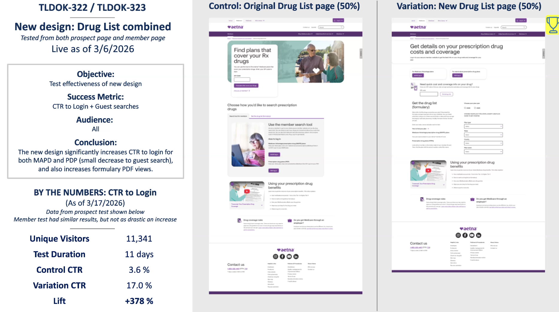
Drug List — combined page redesign
Aetna Medicare · Live 3/6/2026 · Content Designer, UX Writer & Content Strategist
The Drug List experience is a high-intent Medicare journey. Users may be trying to confirm whether their prescriptions are covered, compare drug costs, access formulary documents, or understand prescription drug benefits. That means the page has to support both prospects researching plans and members looking for personalized drug coverage information.
I led content for the combined Drug List redesign, partnering with design and product to create a clearer, more unified experience across the prospect and member pages. The test launched on 3/6/2026 and measured CTR to login and guest searches, with results reported as of 3/17/2026.
-
The redesigned content helped users understand their options more quickly: log in for a more personalized experience, search by drug as a guest, or access formulary documents directly.
Key content updates included:
Reframed the page around prescription drug costs and coverage
Clarified the value of logging in for members
Created clearer entry points for MAPD and PDP users
Supported quick drug search for users who were not ready to log in
Made formulary access easier to find and understand
Used plain language to explain drug list and formulary-related tasks
Helped combine prospect and member content into one more cohesive experience
-
The original page included useful tools, but users had to interpret several different pathways. For a topic as personal and important as prescription drug coverage, unclear choices can create friction fast.
The redesign addressed several content and UX challenges:
Users needed clearer guidance around when to log in versus search as a guest
The page needed stronger framing around drug costs and coverage
MAPD and PDP pathways needed to be easier to understand
Formulary PDFs needed to be more visible and easier to access
The experience needed to support both prospects and members without creating confusion
The page needed to drive more users toward login when that path could provide more relevant information
-
The redesigned Drug List page drove a major increase in login engagement. In the prospect test, CTR to login increased from 3.6% to 17.0%, resulting in a 378% lift over an 11-day test with 11,341 unique visitors.
The member test showed similar directional results, though not as drastic. The redesign also increased formulary PDF views, which suggests that clearer content and stronger page structure helped users find important drug coverage resources. Guest search decreased slightly, but the overall movement toward login aligned with the goal of guiding users to more personalized drug coverage information.
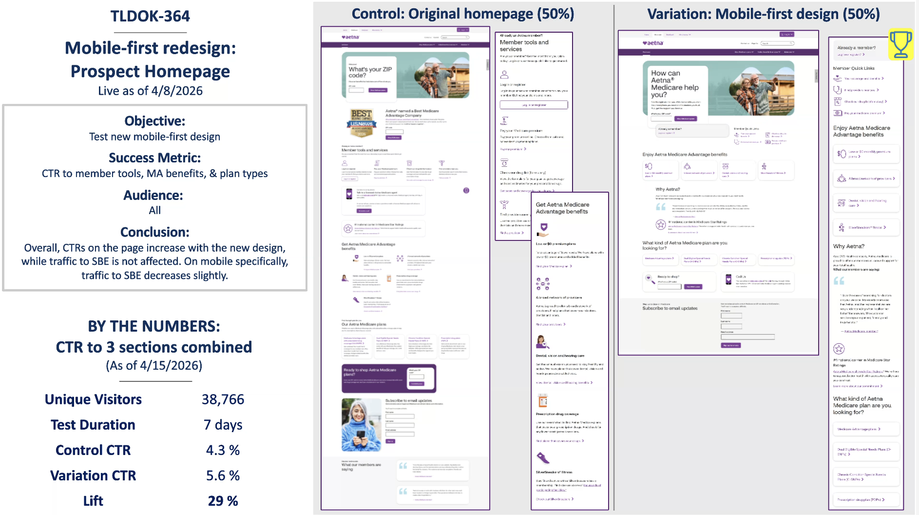
Prospect Homepage — mobile-first redesign
Aetna Medicare · Live 4/8/2026 · Content Designer, UX Writer & Content Strategist
The Aetna Medicare Prospect Homepage is a key entry point for people exploring Medicare options. It needs to do a lot: help users understand what Aetna Medicare offers, guide them to plan information, support existing members, and make next steps easy to find. For a mobile-first redesign, the challenge was not just rewriting content. It was rethinking how the page should work when users are scrolling, scanning, and making decisions on smaller screens.
I led content for the mobile-first redesign, collaborating with design and product to simplify the experience, improve content hierarchy, and make key actions easier to understand. The test launched on 4/8/2026 and measured CTR to member tools, Medicare Advantage benefits, and plan types.
-
The content strategy focused on making the homepage feel more useful from the first screen. Instead of forcing users to sort through broad marketing content, the redesign created clearer pathways based on what users were most likely trying to do.
Key content updates included:
Reframed the hero around how Aetna Medicare can help users
Simplified and prioritized content for a mobile-first experience
Created clearer pathways to member tools, Medicare Advantage benefits, and plan types
Helped organize quick links for existing members
Improved section labels and CTA language so users could act faster
Supported benefit-focused content that explained why users should keep exploring
Reduced content friction by making sections easier to scan and understand
-
The original homepage had a lot of useful content, but the page needed stronger prioritization for mobile users. On mobile, every section has to earn its place. Users need to understand what they can do, why it matters, and where to go next without reading through a long page of competing messages.
The redesign addressed several issues:
The page needed a clearer mobile-first content hierarchy
Key actions needed to be easier to find and understand
Existing members needed faster access to member tools
Prospects needed clearer pathways into plan types and benefits
Content needed to be more scannable and less overwhelming
The page needed to improve engagement across priority sections
-
The mobile-first redesign increased overall engagement across the measured sections. Over a 7-day test with 38,766 unique visitors, CTR to the three combined sections increased from 4.3% to 5.6%, resulting in a 29% lift.
The test showed that a clearer, more mobile-focused content experience helped users engage more with priority areas of the page. Traffic to SBE was not affected overall, though mobile-specific traffic to SBE decreased slightly. Even with that nuance, the redesign improved overall CTR and showed the value of simplifying the homepage around clearer user pathways.